LA ROCHEPOSAY APP
La Pharmacie La Roche Posay is a unique French pharmacy popup that invites consumers to discover the brand’s products and heritage in a fun and interactive way. Guests are able to test and learn about different LRP products, scan QR codes and answer trivia questions, and participate in content creation opportunities throughout the space. By completing the gamified experience, they earn rewards such as French-inspired gifts and LRP products at La Roche Posay’s Brasserie. La Pharmacie La Roche Posay is more than just a popup, it’s an immersive journey into the world of LRP.
Consumer Journey
Our design team leveraged our expertise to design a consumer journey that take new and existing fans of the brand through the funnel in real life.

Project Goal
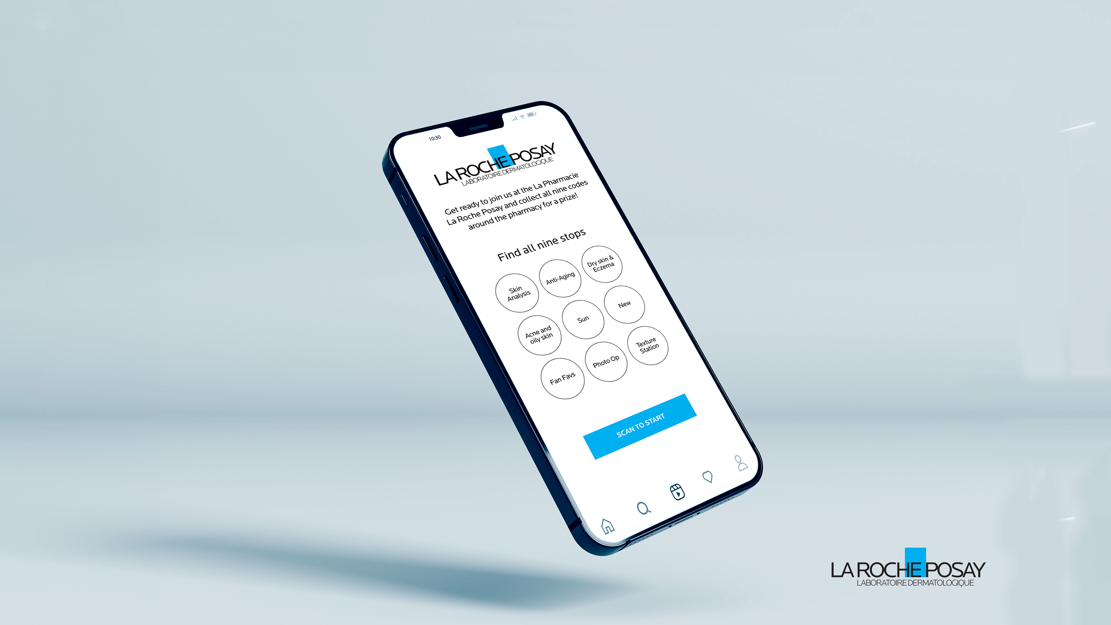
The main goal of this project is to assist users increased their interest in mobile engagement experience to explore interactive gamification, which is finding nine touchpoints.
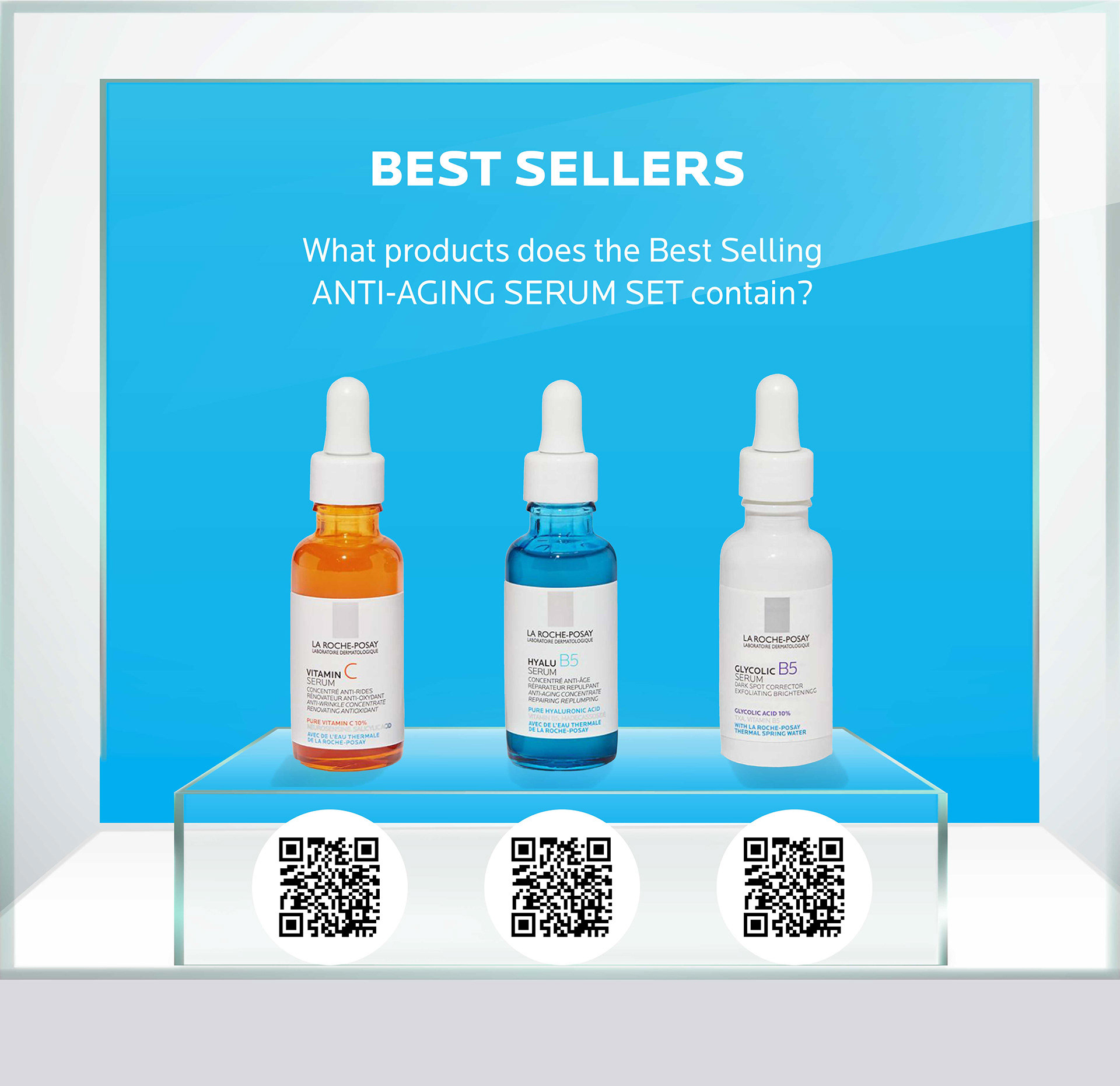
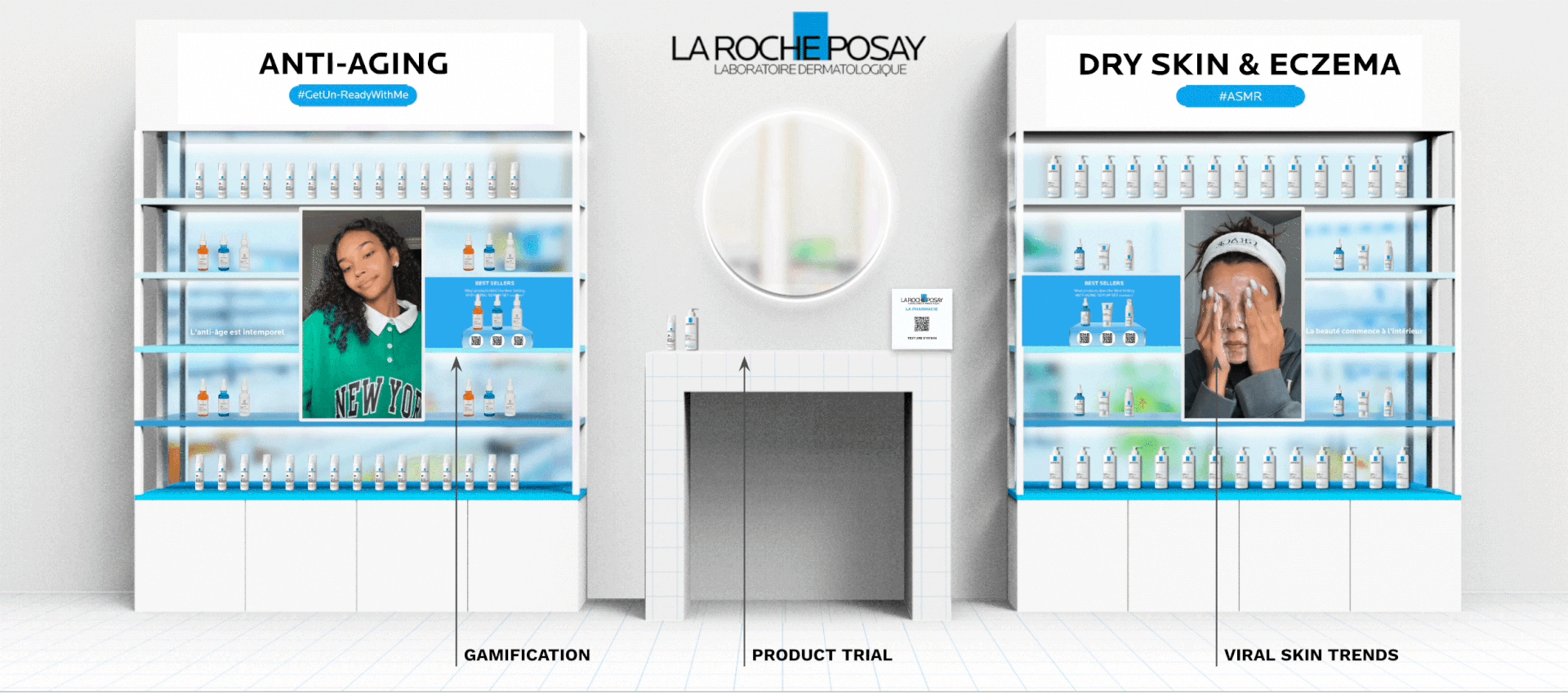
GAMIFICATION - DRIVING INTEREST AND TIME SPENT IN SPACE
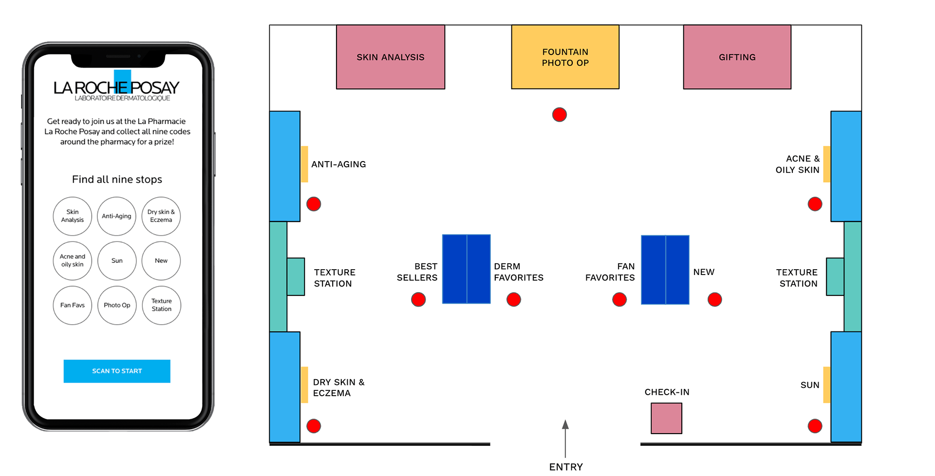
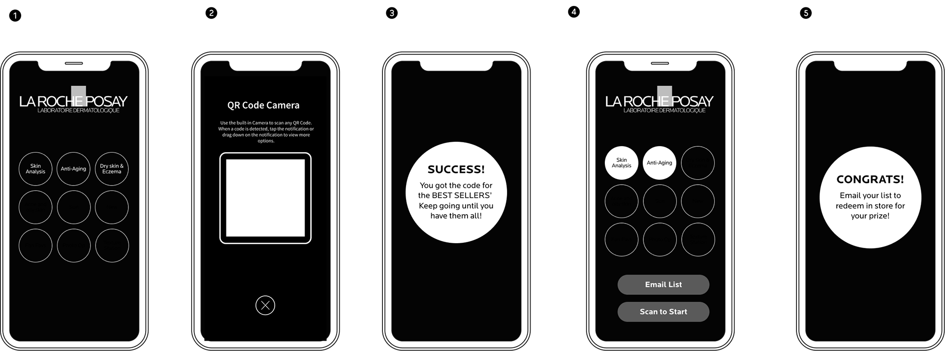
One of the features of our floor plan is the gamification of the user experience. We have designed nine interactive touchpoints that are marked by red circles on the map. These touchpoints allow the users to explore the space in a fun and engaging way. They can learn more about the LAROCKEPOSAY products, as well as participate in quizzes, games, and challenges. The gamification of the user experience aims to drive interest and time spent in the space, as well as increase customer satisfaction and loyalty.
Wireframe
The wireframe for the UX design shows how users can interact with the LRP products in a popup store. The user can navigate through the popup store for finding touchpoints and see where the LRP products are located. Users can explore the floor plan to find the touchpoints with LRP products. The wireframe aims to provide a realistic and engaging experience for the user, while highlighting the value proposition of the LRP products.
UI design
For the UI design, I followed the principles of simplicity and consistency. I chose the brand color as the dominant hue and used a limited palette of complementary colors to create contrast and harmony. I also applied a clear visual hierarchy and a logical layout to guide the user's attention and actions.
Product Testing
Attendees will be invited to get to know LRP products through testing and trials at the texture bar. We will incorporate screens that play social content tying the brand to key trends.
Duration: May to August 2023Tools : Figma / Illustrator / Photoshop / Protopie
My Roles: UI design / Prototyping
Team: Creative Director / UIUX lead designer in TH EXPERIENTIAL