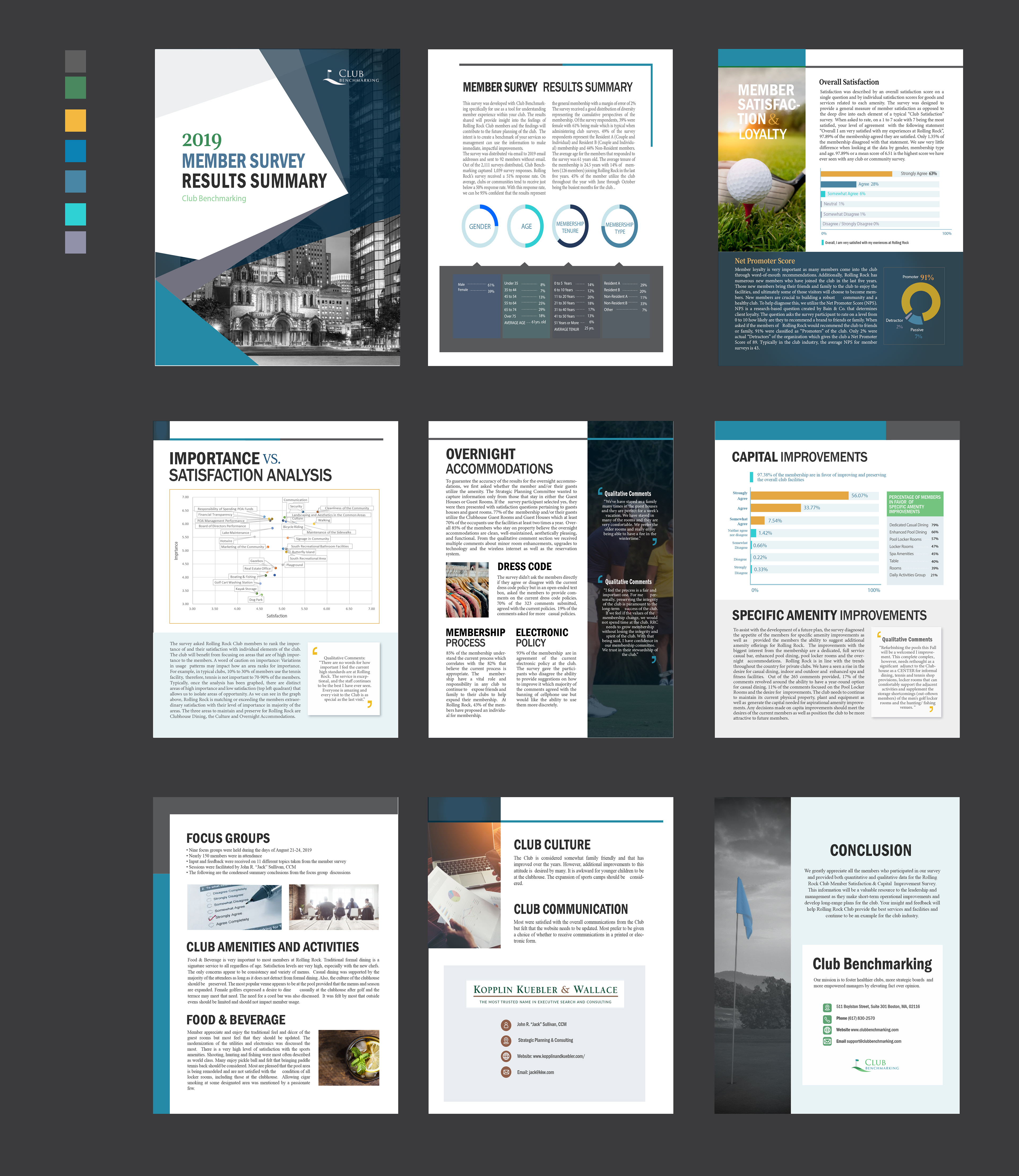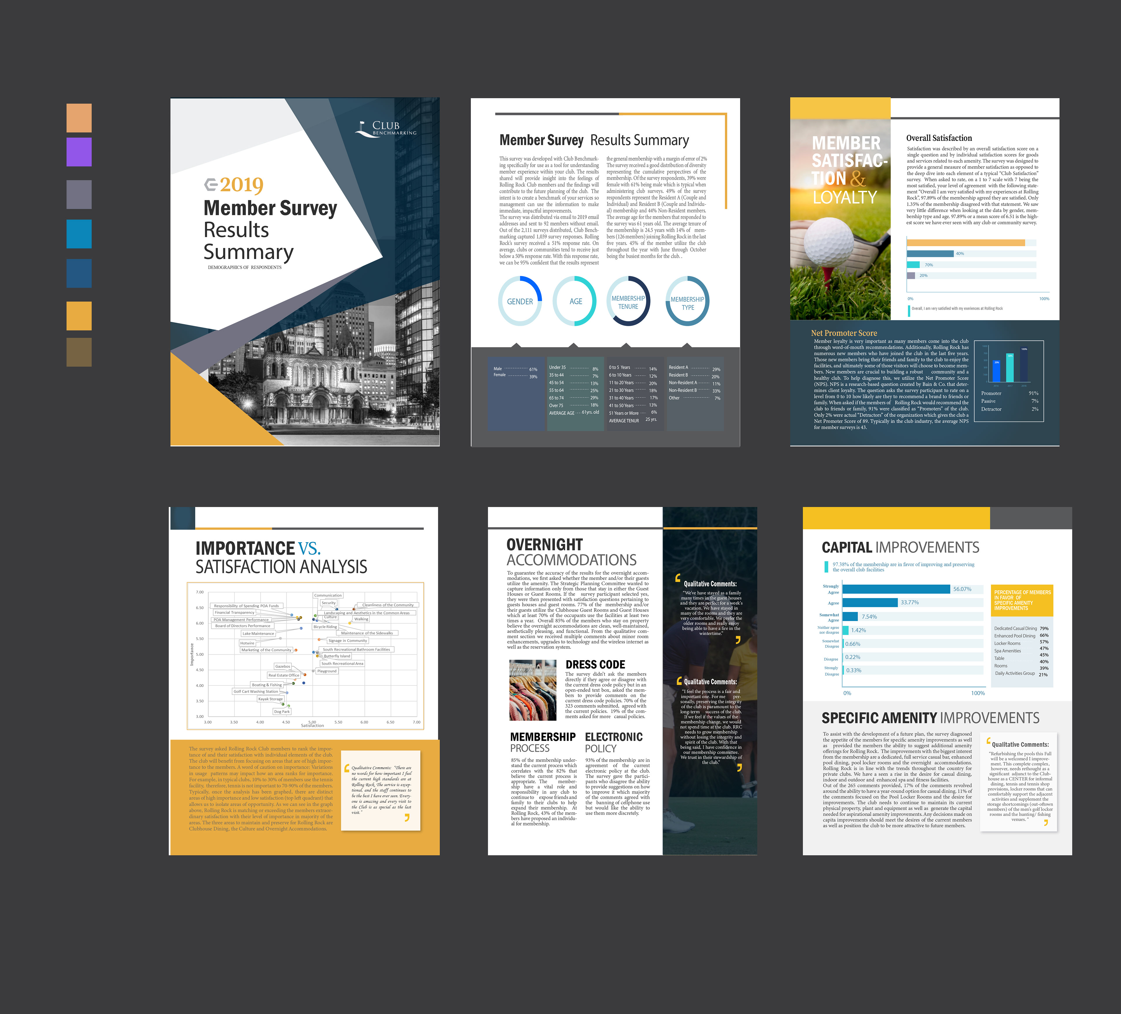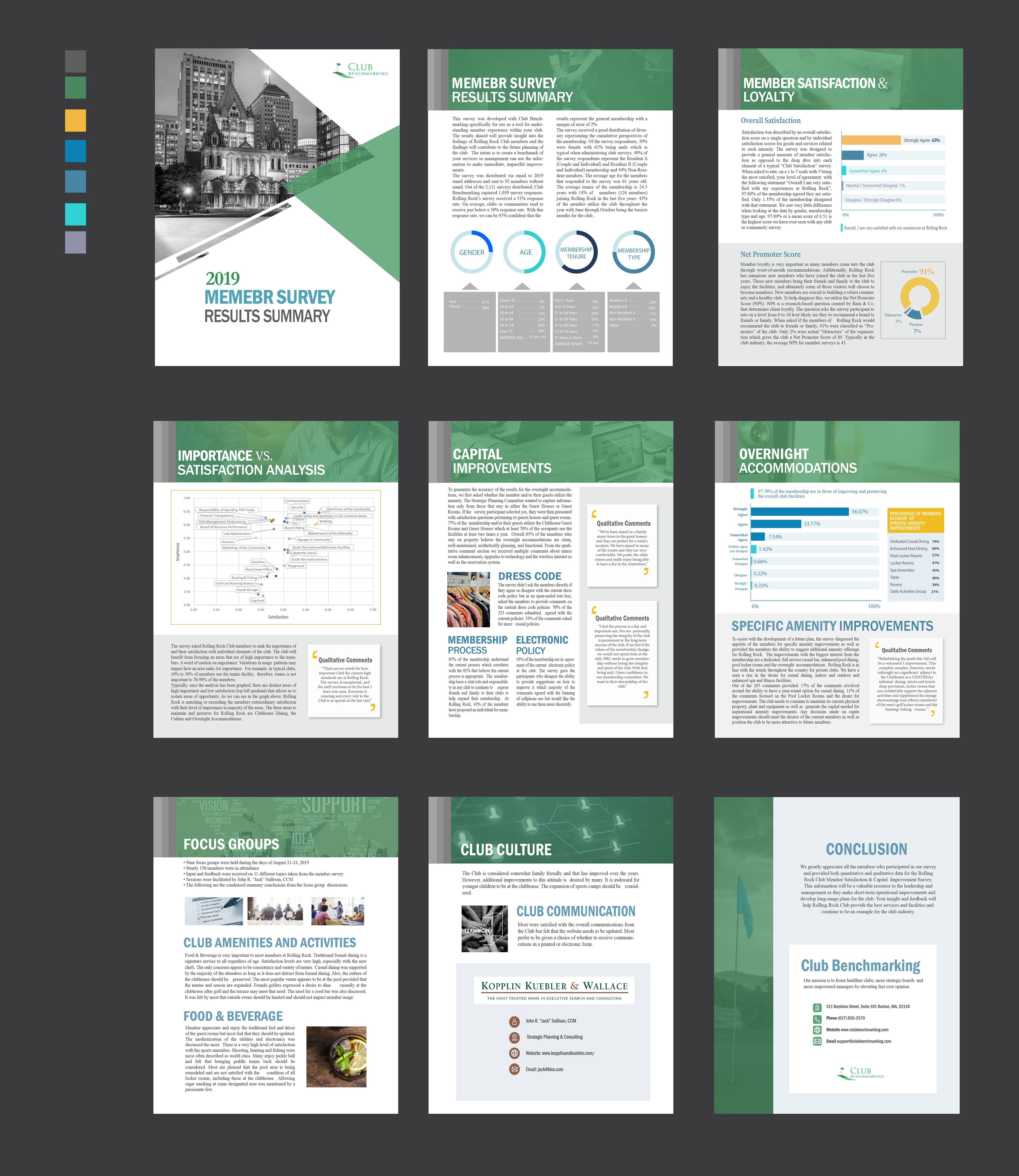
Information Design For Member Survey
One of my client projects involved transforming their survey data into a layout that was both recognizable and easy to understand. My task was to design a clear and engaging presentation of their survey results, ensuring that the charts were both visually appealing and informative.
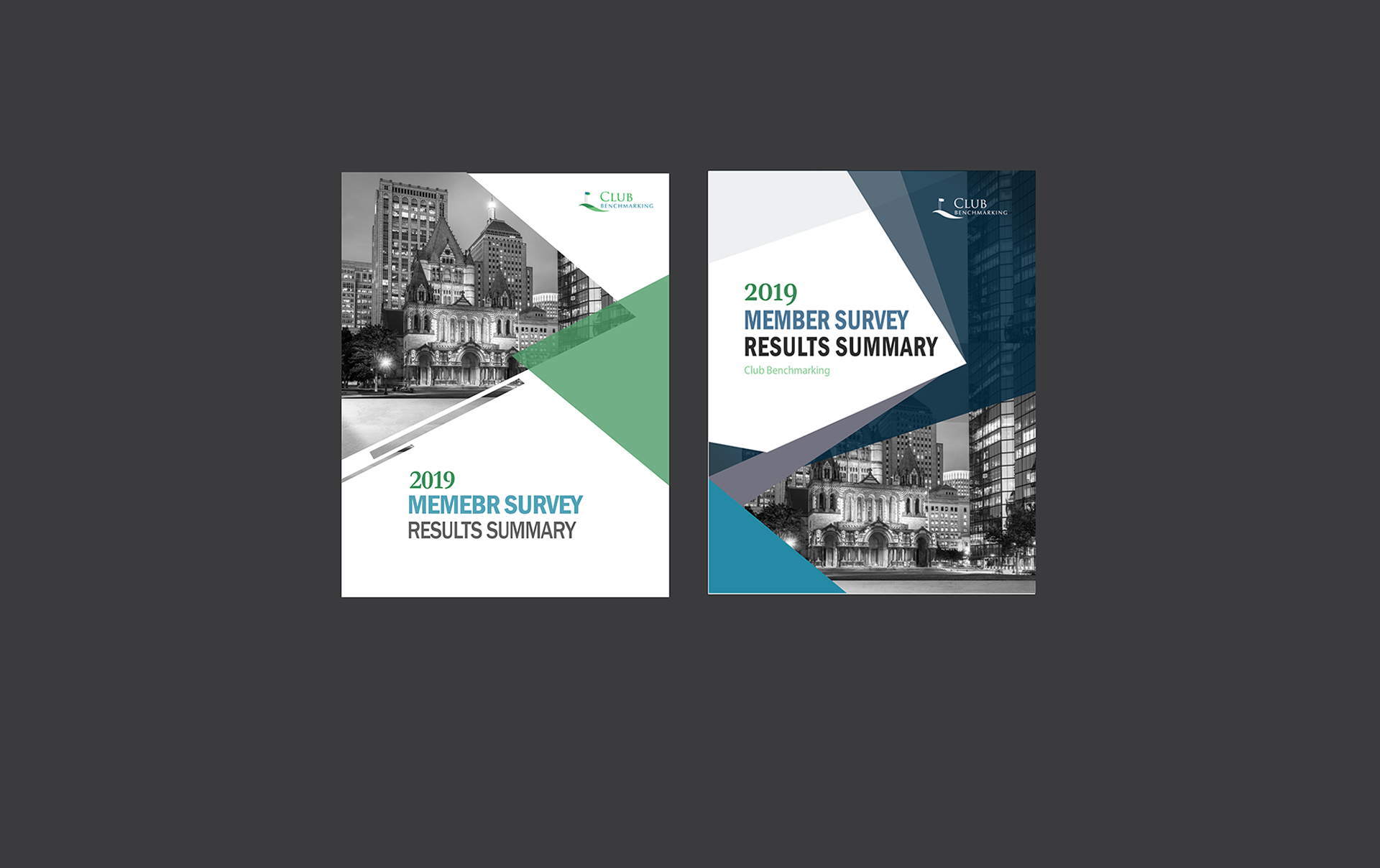
Three design concepts for our client :
The client tasked me with developing three distinct design concepts for their project. For the first concept, I focused on leveraging their established brand color palette, emphasizing the use of blue to convey a sense of expertise and trustworthiness. In the second concept, I introduced brighter colors, such as yellow, aiming to create a more user-friendly and approachable feel for the research booklet. This approach was intended to make the material feel accessible and engaging. For the final design, I incorporated shades of green, strategically chosen to evoke feelings of calmness and reliability. This color choice was aimed at enhancing the users' perception of the brand as trustworthy and dependable. Each concept was carefully crafted to not only align with the client’s branding but also to resonate with the target audience on an emotional and psychological level.