Procreat, Photoship, Illustrator
Project Overview
Board games inherently possess a narrative element. In my initial concept phase, I concentrated on pure design elements and pattern integration. However, I soon realized that without a compelling story, the board games lacked the persuasive power necessary to captivate consumers.
To address this, I drew inspiration from the quintessential experience of dice-throwing in a Las Vegas casino game. I conceptualized this action into a narrative I called 'The Flying Dice.' This sparked a creative process where I brainstormed various encounters one might have while soaring through the skies. These ideas were then translated into preliminary sketches, setting the stage for a story-rich board game design.
Logo Design
Initially, my focus was on creating patterns and illustrations rather than designing a logo. However, observing how other products enhanced their visual appeal with distinctive typography prompted me to reconsider the importance of a logo for effective branding. With this in mind, I revisited the concept, this time centering on the dice motif to craft a unique logo. Drawing inspiration from the dice, I designed new letterforms, incorporating the small dots characteristic of a dice surface to add a distinctive touch to the typography.
Illustration Concept 1
In the featured illustration, I depicted the dynamic action of throwing dice, deliberately targeting an adult audience with a captivating design. I aimed to infuse the box design with playful illustrations that suggest a narrative, adding an element of storytelling to the visual experience. This concept leaned towards intuitive expression; I personally staged the dice-throwing gesture and translated it into an illustration. While striving to align the design closely with the logo's aesthetic, I acknowledge that the legibility of the hand-drawn elements did not meet the desired clarity, which is an area for further refinement.
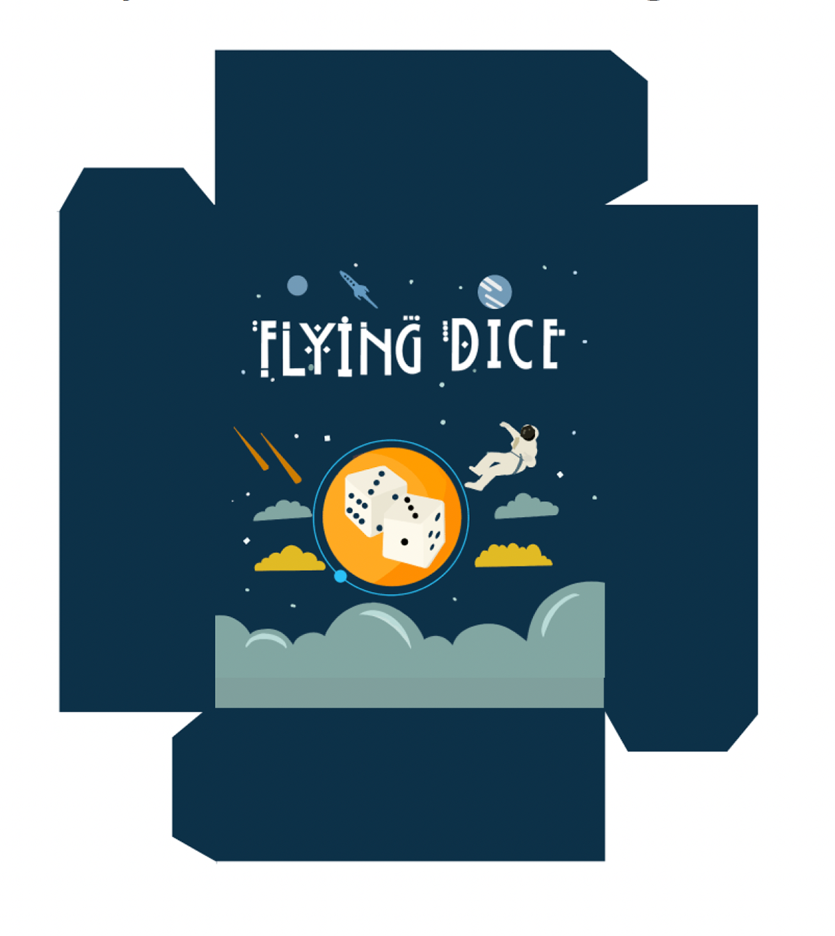
Final Design Mock Up
Concept 2
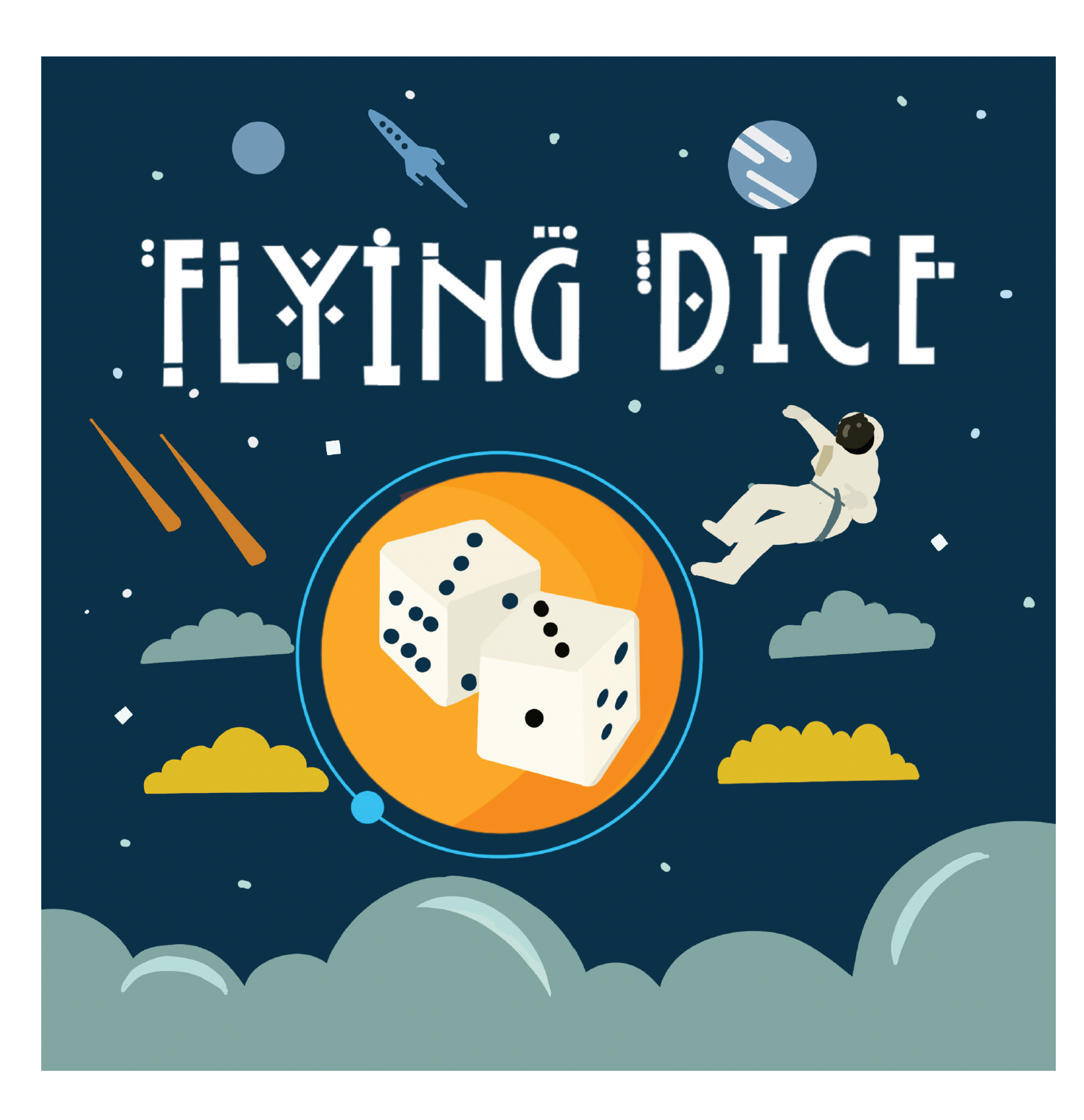
After finalizing the three design concepts, I revisited the project's direction. Initially, my designs catered more to children due to their simplicity. However, as the project evolved, the designs naturally appealed to an adult demographic as well. To ensure the designs remained dynamic and engaging, I conducted further research into other companies’ board games, drawing inspiration to craft more vibrant and lively illustrations. Central to the narrative was the dice, which I strategically positioned at the heart of each design. This was not only to anchor the story in the theme of the universe but also to maintain a coherent connection with the logo design, bridging the elements of story and brand identity.


